Stampin' Up!

“The Best is Yet to Come” x 2

Hello everyone! I apologize that it has been so long since my last blog post. I had a bunch of blog posts written ahead of time and auto posting for the week after my baby was due. I wasn’t prepared for her to come two weeks late!

Before we get to the cards, here is Scarlette Autumn.  The last two weeks have been awesome (and tiring) adjusting to life with a baby. 🙂IMG_3484

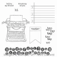
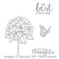
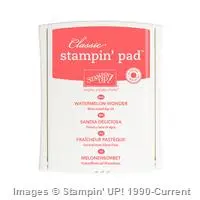
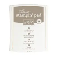
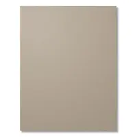
As I sat down to do some papercrafting for the first time since Scarlette’s birth, I decided to start with the newest Stampin’ Up! colors, the 2015-2017 In Colors. I focused on Watermelon Wonder and Tip Top Taupe. I really like this sentiment because it is so versatile. I think it could work for Wedding, Anniversary, Birthday, Congratulations, Graudation and more.
Simple

This first card is on the simpler side, but I think the Watermelon Wonder flower really pops and gives the card just the right amount of interest.

Envelope

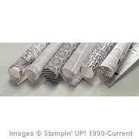
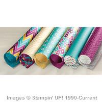
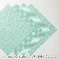
I used the 2015-2017 In Color Designer Series Paper Stack to make a custom envelope for the above card. I loved the polka dot pattern in this color so much I was inspired to make another card using the same DSP.

Bold

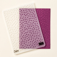
The second card is on the bolder side due to the bright color and pattern of the DSP.  I thought it would be cool to round just some of the corners of the sentiment piece and card base. The dimensions of the sentiment piece are 3 x 2 1/2″. I stamped the butterfly in Tip Top Taupe and popped it up with Stampin’ Dimensionals.

Group

Here is a group shot. I think the envelope would be lovely with both cards. I might have to make another one. 🙂

Leave me a comment and let me know which card you prefer, the simple or the bold.

Thanks for reading! I hope to keep the posts coming a little more frequently.

Joyful stamping!

~Stephanie

Supply List

Built for Free Using: My Stampin Blog

Just Because Cards, Stampin' Up!

Typset Hello

Hello everyone!  Today I have a card inspired by a theme challenge. There is a very cool website called Split Coast Stampers that has lots of inspiration for stampers. Their Free for All Friday challenge this week is “Celebrate Newsprint”. I’ve included a description below.

Celebrate Newsprint:
“You could use a stamp or [patterned paper] with a newsprint background or use an actual newspaper or magazine – stamping on newspaper & magazines looks great. You could bring typewriters, typed words …..anything that celebrates the printed word.”

Here’s what I came up with:

Typset Hello

This challenge really appealed to me because I’ve always loved reading and the printed word. I have also been looking for more inspiration for the Tap, Tap, Tap stamp set. It took me awhile to decide on a color combination that felt right. Leave me a comment and let me know what you think. Would you suggest other colors?

I stamped the alphabet image in Lost Lagoon on Lost Lagoon cardstock. I stamped off before stamping on the cardstock. I sponged Soft Suede ink around the edges of my newsprint DSP (Typset Specialty Designer Series Paper) and also sponged in the center of the DSP.

Typset Hello Close Up

I stamped the typewriter image in Lost Lagoon on Very Vanilla Cardstock and fussy cut it out. I tied in the Blackberry Bliss cardstock layer with a Blackberry Bliss sentiment. I love how it fits right in the blank space of the typewriter.

Dimensions: The card base is 4 1/4″ x 11″ (scored at 5 1/2″). The Blackberry Bliss layer is 3 1/2″ x 4 3/4″.  The DSP layer is 3 1/4″ x 4 1/2″.

I hope you are inspired to make a newsprint/typed word themed card too!

Joyful stamping!

~Stephanie

Fall Cards, Just Because Cards, Stampin' Up!, Sympathy Cards

“Thinking of You” for PPA270

Hello everyone! Today I have a fall inspired card for another Pals Paper Arts color challenge (PPA270).ppa270CHALLENGE

Usually I stamp on Whisper White or Very Vanilla, but I thought I’d try out Sahara Sand on this card since it was part of the color challenge. I think it turned out pretty neat. And isn’t that little swing just adorable? It is stamped in Always Artichoke, as is the wood grain background & the sentiment. The tree is stamped in Sahara Sand.

PPA270

This leaf stamp from the set “Sheltering Tree” is awesome for stamping off. Stamping off is where you stamp once and then stamp again without re-inking. With this stamp I think stamping off gives the image a windblown look. It is a little hard to see in the pictures, but I scattered several Rhinestones in the tree leaves to brighten up this darker toned card a little.

PPA270Closeup

Thanks for reading! I hope you are inspired to make some fall cards of your own!

Joyful stamping!

~Stephanie

Punch Art, Stampin' Up!, Wedding Cards

Owl Wedding

Hello everyone! I’ve been browsing Pinterest for more cute owl cards. I just had to make this adorable owl wedding card. Here is the link to the original card.

Owl Wedding

I think if I made this card again (which I can definitely see happening 🙂 ), I would probably experiment with different layering behind the owl images.

Here are the dimensions of the card base & layers: Whisper White base= 5 1/2 x 8 1/2″ (scored at 4 1/4″), Basic Gray layer= 4 x 4 1/4″, Basic Black layer= 3 1/2 x 4 1/4″, Whisper White layer= 3 x 4 1/4″, Basic Black strip= 4 x 3/4″.

Owl Wedding Close Up

My favorite parts of this card are the owl bride’s dress and crown. It’s crazy how a little glimmer paper and some rhinestones can make an owl look like a girl. 🙂

I hope you are inspired by this post. Re-creating this card was a lot of fun! I invite you to check out my Owl Builder Punch board on Pinterest.

Joyful stamping!

~Stephanie

Price: $5.25

Supply List

Built for Free Using:  My Stampin Blog


All Occasion Cards, Designer Series Paper Cards, Stampin' Up!

Negative Butterfly

Hello everyone! I thought the title of this blog might pique your curiosity. Can a butterfly ever be negative? It can when you die cut a butterfly. 🙂 The negative image is the outer image. The actual butterfly die cut is then the positive image.

I have had a pile of these negative butterfly images (the purple cardstock) sitting near my craft area since July.  A friend and I helped my team lead make her swaps for the Stampin’ Up! Convention at the end of July. We used the positive butterfly image for one set of cards. I just knew I could find a use for the negative image as well. Two months later I’ve done it!

Negative Butterfly Image

Here’s a close up of the butterfly. Can you see the line of tiny pearls in the center?  Turns out they are actually retired. I hadn’t realized. You can easily switch them out for some Rhinestones Basic Jewels. 

Close Up Butterfly

Blelow is an example of a positive die cut image.  It is from a past post, Elegant or Edgy. This larger butterfly is part of the same die cut set that was used to create the smaller negative butterfly image above.

positive butterfly

This die cut set, Butterflies Thinlits Dies, is one of my favorites.

butterfly thinlits

I hope you are inspired to create with positive and/or negative die cut images. Now you know you can use both!

Joyful stamping!

~Stephanie